Heartthrob Interactive is a video game testing company. It also offers design services, such as scriptwriting and gameplay mechanics design. The company hails from Poland and operates as a small team of enthusiasts with different specializations, such as narrative design, graphics, quality assurance, and marketing.
First contact
The client came to us with a fairly well-thought-out graphic concept for the website. They had a clear vision of what information was to be presented on the website. This was quite surprising to us, because the level of preparation seemed quite exceptional to us. As it turned out later, the project itself was exceptional.
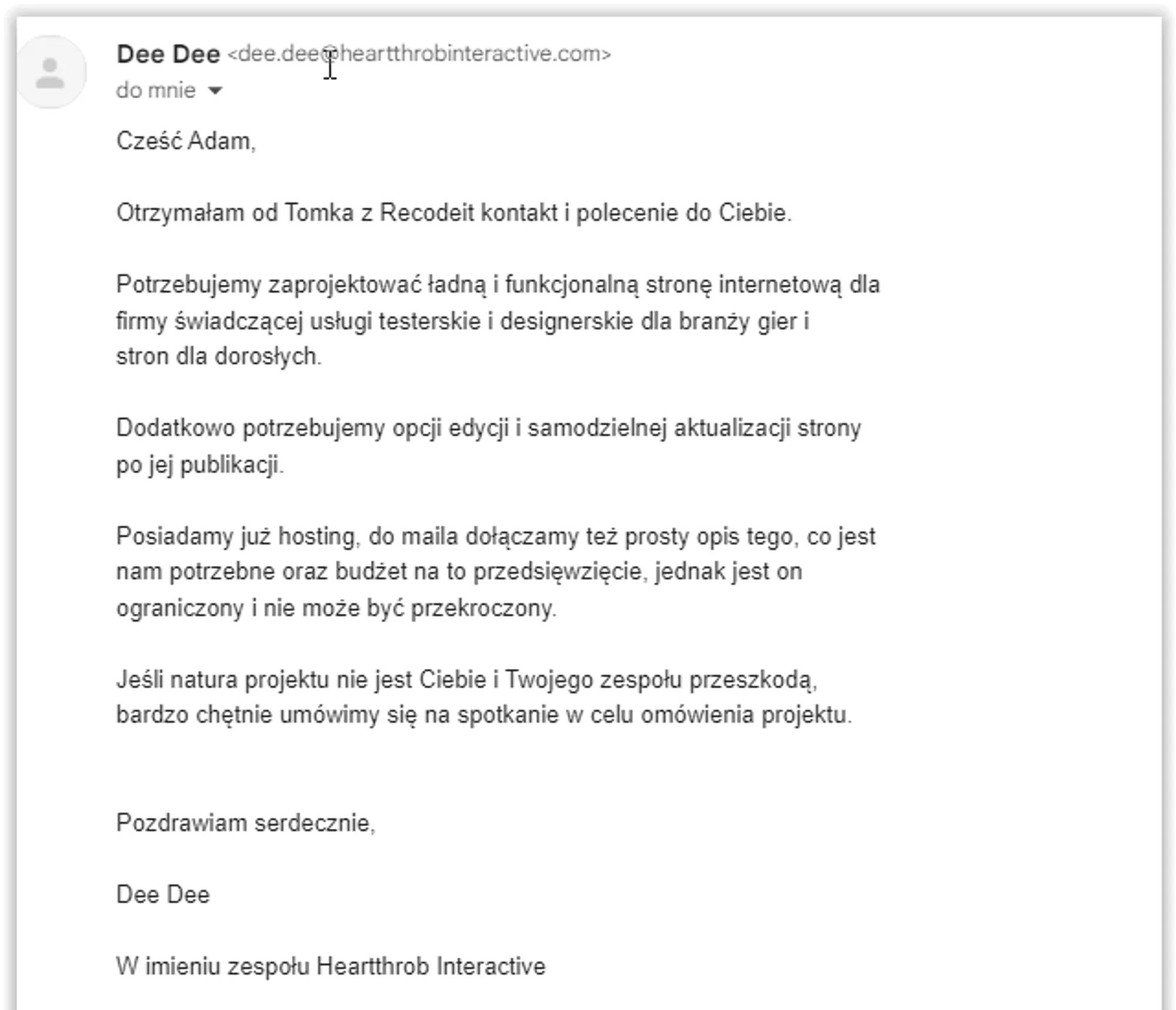
When the client came to us, he already had a fairly well-thought-out concept for the website. The submission included a PDF file with a description of the sections the client would expect on the website, links to pages that could be used as inspiration, and even a ready-made color palette. However, we still had to step into the client's shoes, understand exactly the motivations, why he decided that the website should present this and not other information.
This approach on our part was one of the most important reasons why the client decided to cooperate with us. The Heartthrob team had already conducted preliminary talks with other companies, but they usually encountered a rather standard approach and adjustment to the contractors' work template. We focused on an exceptionally individual approach and comprehensive treatment of the subject, which, as it turns out, other companies lacked.
The very model of project implementation in which we work also convinced the client to us, because it closely resembles how games are created.
Collaboration Process
The project was implemented in accordance with our proven cooperation model. The first stage was to determine what the client expected and what they actually needed. This allowed us to prepare a graphic design of the website. This design allowed us to confirm that each party understood the entire project in the same way, which allowed us to avoid any inconsistencies at an early stage of work.
After the client approved the graphic design of the website along with a clickable prototype, it was time for the programming part. As part of this stage, we recreated the previously prepared graphic design 1 to 1, taking care to maintain maximum efficiency and full responsiveness of the website, which was quite a challenge given the established appearance. Of course, we also made sure that changing any element on the website was simple and intuitive thanks to the Strapi content management system.
When the site was ready, we uploaded it to the server under a “test” domain. Thanks to this, we could proceed to check all of its functionalities as if it were the final version, while ensuring that the client would receive the final product of the highest quality. During the client’s testing stage, problems with the presentation of elements on the iPad were detected. Of course, we quickly made corrections and, in accordance with the saying “today’s mistake is tomorrow’s process,” we also added tests on this device to our site testing process.
In parallel to testing the site, we also analyzed the content on it. Unfortunately, some of it described what the customer is like instead of what problems the customer solves. We changed some of the content to use the language of values and increase interest in the final recipient of the site.
Throughout the entire project creation process, efficient communication was essential. The specifics of the project required intensive communication with the client, because any changes could delay the project. For this reason, the main communication channel in the project was Discord, not email.
Challenges
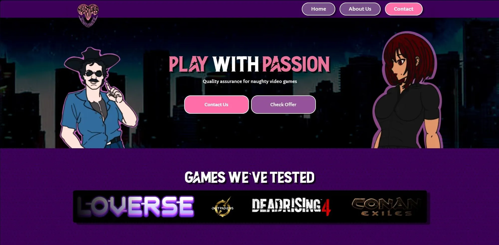
When creating the project, the biggest challenge was to combine a unique design inspired by 80s manga with a functional and useful user interface. A style that attracts attention often does not go hand in hand with ease of navigation, and we wanted the site to not only look good, but also be intuitive. That is why we had to find a balance between aesthetics and user convenience. Designing a UI in this style required exceptional precision from us, especially since each element, from buttons to menus, had to be consistent with the overall concept and at the same time easy to use.
During testing on various devices, we discovered an issue with older iPad models, on which the site would display incorrectly - graphic elements would be separated and some functions would not work properly. This is a common problem, as many sites have difficulty optimizing for older devices. However, we managed to solve it by changing the structure of the code, which not only fixed the display on older iPads, but also made the site work correctly on even more devices. Thanks to this, users, regardless of the device model, can enjoy a fully functional site.
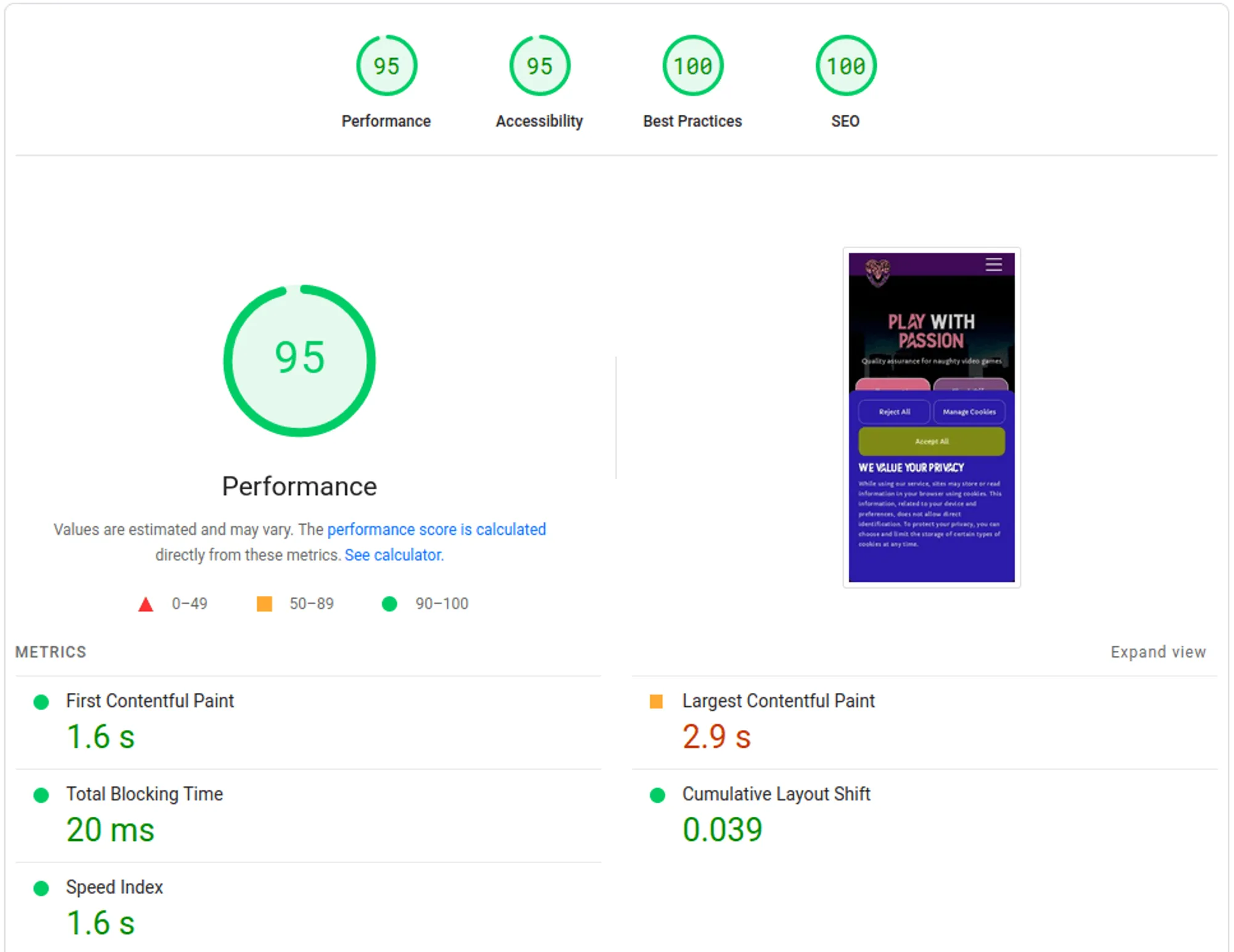
Despite the small number of tabs, it was necessary to prepare the site for various marketing activities. For this purpose, we installed integration with Google Tag Manager, which works in accordance with the law (cookies are not saved before the user gives consent) and does not deteriorate the site's performance, which is rare on the Polish market. The layout of the home page itself, instead of acting like a reception, also leads the user to perform an action, which is to send a request via a contact form. Thanks to this approach, the home page can also be used as a place to which traffic from ads is directed.
Another topic we had to address during the implementation of this project was hosting. When the client contacted us, he already had shared hosting dedicated to WordPress. This service was also connected to email. The websites we create are characterized by high-class performance and security and for this reason they must be hosted on VPS servers that are not shared with others. These servers are also secured by us in a specific way. In order to relieve the client, we took responsibility for contact with the current hosting provider and proposed an appropriate final solution.
Final effect
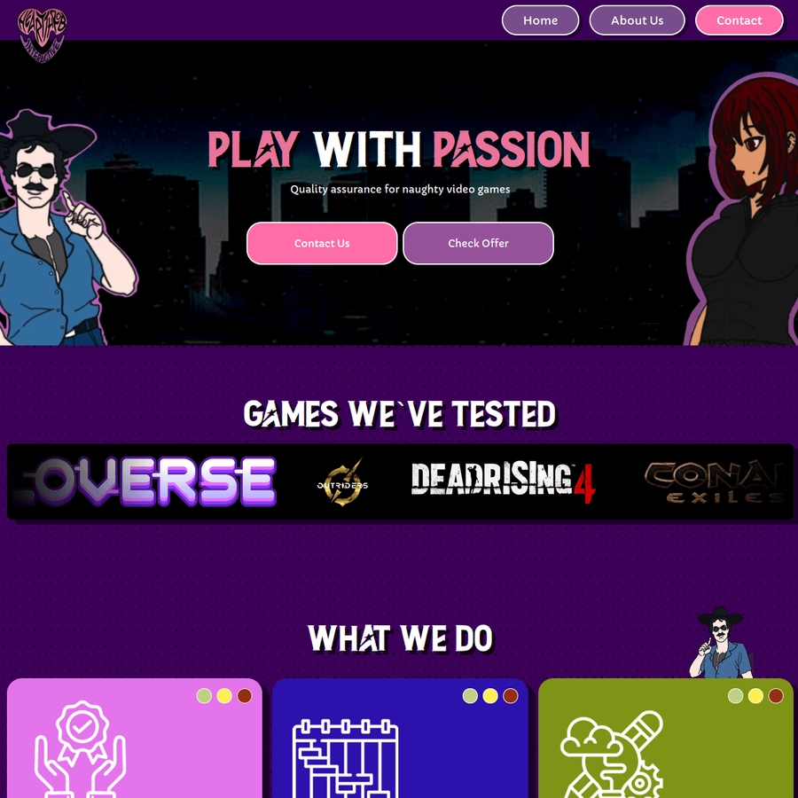
The final product that the client received is a fully responsive website, maintained in a retro and manga style. The project stands out with its unusual style, while maintaining ease of managing the content of the site. Despite the numerous graphics, we delivered top-class performance, thanks to which the site loads instantly even with weaker internet.
We also made sure that the performance was always at a constant level. The process of optimizing graphics and the site itself is done automatically, so the client does not have to worry about compressing photos. Additionally, the site is fully responsive, so it will look good on various devices even if the client decides to change its sections.
Customer review
At Heartthrob Interactive, we didn't have much luck finding a developer for our website at first, and we weren't able to create our dream business card ourselves. While searching for the right developer for us, we dug through half of Polish Google to find someone who understood our project.
We are a group of experienced testers and game designers who knew from the beginning how they wanted the site to look and work. Unfortunately, apart from one company that couldn't accept the order, for several months we couldn't reach an agreement with anyone - they didn't understand the project.
We were forced to use templates and simple solutions, the number of characters and graphics was limited, or we were simply told that it was a “very non-standard project that required additional work.”
We managed to get to Betterize by recommendation and we immediately established a very pleasant contact. Our outline was not only immediately discussed, but also improved in many respects.
Frequent conversations and brainstorming sessions instead of email exchanges have helped a lot in creating a website that is both functional and shows our diverse skills, as well as being well-optimized despite the large number of graphics.
After very creative but hard design work, the site was created very quickly. Coding, optimization and testing along with fixing errors took only a few days.
We are very pleased with our cooperation and intend to continue it not only in updating the website, but also in its expansion in the future.
We highly recommend working with Betterize - it's the only team in Poland creating websites that will change templates and go beyond the comfort zone for their clients.
Are you in a similar situation?
If this case study resonates with you, or you are simply looking for a website developer, you may be interested in our free consultation. During a no-obligation conversation, we will analyze your challenges and try to find the best solution.

Dee Dee
" We are very pleased with the cooperation and intend to continue it not only in updating the site, but also in its expansion in the future. We highly recommend cooperation with Betterize - it is the only team in Poland creating websites that will change templates and go beyond the comfort zone for its clients. "

Adam Naworski
