Website Structure Planning - How to Approach It in 2024
Designing a website requires meticulous planning and understanding of user needs. In 2024, as technology and user expectations evolve faster than ever before, it is crucial to plan the structure of your website at an early stage. This structure should not only be modern but also functional and accessible to users.
Common Types of Websites

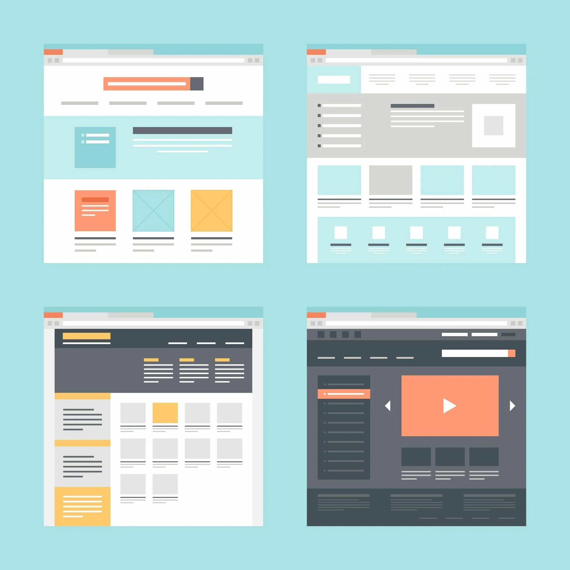
Choosing the right type of website is key to effectively presenting your company's offer, services, or personal brand online. From simple business card sites through to expansive corporate websites, and dynamic portals rich in content – each type of site serves a different purpose and reflects the specific needs of its users. In this section, we will discuss the most commonly encountered types of websites, their characteristics, and applications to help you choose the best solution for your project.
Single Page (Single Page)
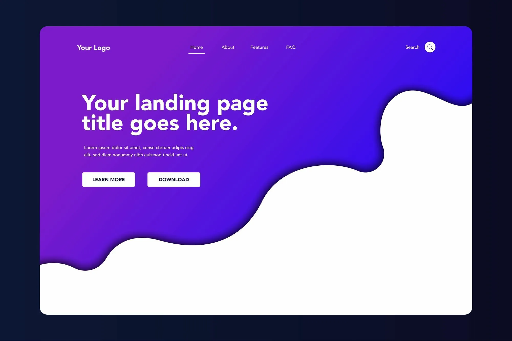
A single page, also known as a landing page or business card site, is characterized by simplicity and focus on one main goal - conveying key information about a company, product, or service in a condensed form. These sites are usually very visual, with minimal text and a strong call to action (CTA). They primarily serve to quickly inform about the existence of a company, the services it offers, and to facilitate contact.
Example : The law firm "Kowalski & Partners" wanting a simple online business card might choose a single page. This page would contain basic information such as location, opening hours, a brief description of specialization, and a contact form. The aim of the page is to quickly introduce the firm and facilitate potential clients in making contact.
Small Simple Site
A small simple site consists of several subpages but still maintains simplicity, offering more detailed information about the company, its offerings, and team. Such sites often include sections like "About Us", "Offer", "Contact", and sometimes "References" or "Gallery". They are ideal for companies wishing to present more information without the need for complex functionalities.
Example : The law firm "Nowak & Associates" wants to more thoroughly present its offer to clients. The firm's website contains several subpages, including "About Us", where it introduces the company's history and specializations, "Offer" with a detailed description of legal services, "Pricing", "Gallery" with photos of the team and completed projects, and "Contact" with a map and contact form. The goal is to provide a more detailed presentation of the firm and its offerings, encouraging direct contact.
Large Expanded Site
A large, expanded site is a comprehensive website with a broad content structure, including not just basic information about the company and its offerings but also an extensive blog, service or product catalog, content search, multiple landing pages dedicated to specific services or marketing campaigns, and often integrations with external services, such as reservation systems or online stores. These sites are designed to actively engage users and encourage interaction.
Example : The law firm "Juris & Innovatio" wants to actively expand its online presence. Their site includes an extensive blog with educational articles on legal topics, a section with free guides and document templates, a content search to ease navigation, and dedicated landing pages for individual legal services. Additionally, the site offers a newsletter with the latest news and legal advice. The goal is not only to present the offer but also to position itself as an expert in the industry and build trust by providing valuable content.
Aspects to Remember
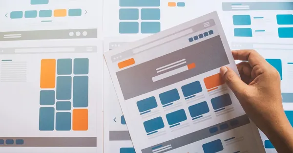
Designing a website's structure is a crucial element in creating a user-friendly and functional site. Proper planning not only facilitates navigation and access to sought-after information for users but also supports SEO efforts, helping search engines effectively index the site. In the following sections, we will focus on four fundamentals that will help you create a logical and intuitive structure for your site, enhancing its usability and search engine rankings. Remember that your profits may far exceed the cost of the website .
Clear Sitemap
Example : An online clothing store might have a sitemap that starts with main categories such as "Men", "Women", "Children", and then branches into subcategories like "Footwear", "Outerwear", "Accessories". Such a structure facilitates quick access to sought-after products.
Easy Accessibility of Every Page
The 3-click rule: Users should be able to reach any page in no more than three clicks.

Example : On a public library's website, a user looking for opening hours should be able to find this information starting from the homepage, then moving to the "About the Library" section, and finally to "Opening Hours".
Consistent Labeling
Maintaining consistency in labeling links and sections on the site helps users build an intuitive understanding of the navigation.
Example : If you have an "About Us" section on the homepage, ensure that every reference to this section on other subpages uses the same term, instead of alternatives like "Our Company" or "Who We Are".
Intuitive Content Hierarchy
A good site structure reflects the importance of information through a content hierarchy
More important information should be more visible and accessible.
Example : An online course page might feature its most popular courses or those currently on sale on its homepage, encouraging users to explore the offer further.
Keeping these aspects in mind, you can create a website that is not only user-friendly but also effectively meets business goals.
Tips for Key Sections on the Site
To make a website an effective tool in building an online presence and supporting business goals, strategic planning of its structure is key. Properly designed sections can significantly impact user experiences and the effectiveness of brand communication. Below, we provide tips for key sections that should be present on your site.
Hero Section

The hero section is a key element that must immediately grab visitors' attention. It should clearly present what your company offers and encourage users to explore the site further.
- Use dynamic elements: Consider using animations or interactive elements that add life to your site. Dynamic effects can increase user engagement.
- Personalize the message: Tailor the message in the hero section to your target audience. Use language that resonates with your potential customers, showing that you understand their needs and problems.
- Highlight your uniqueness: Emphasize what makes your offer special. This could be an innovative product feature, unique customer experience, or special offer.
Section with Testimonials
Customer testimonials build trust and authenticity for your brand. Carefully selected and presented, they can persuade undecided visitors to use your services.
- Success stories: Present stories of clients who have succeeded thanks to your product or service. Narrated stories can be more convincing than simple testimonials.
- Tailor to the industry: If possible, present testimonials from individuals or companies recognizable in your industry. This increases credibility in the eyes of potential customers.
- Show diversity: Present testimonials from various types of clients – from individual consumers to large corporations. This shows the versatility of your offer.
Contact Form

A simple and intuitive contact form is essential to facilitate users in making contact with you. Thoughtful design of this section can increase the number of inquiries from potential clients.
- Form personalization: Customize the contact form to the type of inquiry, e.g., separate forms for business inquiries and customer support. This facilitates faster processing of queries.
- Motivate action: Add a short motivational text above the form, explaining how quickly a response can be expected or what benefits come with making contact.
- Encourage interaction: Offer alternative contact methods, such as live chat or phone numbers, for those who prefer direct conversation.
FAQ Section

Frequently Asked Questions (FAQ) not only provide an effective way to communicate with users but also offer an opportunity to present additional information about your products, services, or project execution processes.
Tips:
- Structure and organization: Organizing questions into logical categories helps users find the information they are interested in. This could be a division into topics related to the ordering process, offer details, or post-sales support.
- Language and form: Answer questions in simple and understandable language, avoiding industry jargon. Aim to be as specific as possible, avoiding general answers that may not dispel users' doubts.
- Updates: Regularly reviewing and updating the FAQ section ensures its relevance and accuracy. Add new questions that arise among users, and update answers to reflect any changes in your offer or procedures.
Portfolio/Case Studies
Presenting previous works or case studies is an excellent opportunity to show potential clients your skills, experience, and successes. When preparing this section, focus on a detailed description of projects that best reflect the value you can deliver to your clients.
Tips:
- Detailed project descriptions: Describe each project in detail, highlighting the challenges you faced, the solutions you implemented, and the results you achieved. This presentation method helps potential clients understand your approach to work and your ability to handle difficulties.
- Use of visual materials: High-quality photos, graphics, or videos of completed projects can significantly enhance the attractiveness of your portfolio. Visual presentation of works allows for quick engagement of visitors and a better understanding of the scope of your services.
- Customer testimonials: If possible, add testimonials and recommendations from satisfied clients to the project descriptions. Authentic reviews can significantly increase trust in your brand and convince potential clients to use your services.
- Creating separate subpages: For sites with a rich portfolio, consider creating a dedicated subpage for each project. This allows for a more detailed presentation of each implementation, as well as facilitates navigation and improves the overall clarity of your work presentation.
Remember, each section of your site should be designed with the user and their experiences in mind. Good planning and execution of these key sections can significantly impact the success of your online presence.
Summary
Meticulous planning of the website structure is the foundation of success for any web project. In 2024, when user expectations are high, and the competition in the online market is immense, none of the above aspects can be overlooked. By keeping in mind the key sections, new trends, and audience expectations, you can create a site that not only attracts attention but also effectively converts visitors into loyal customers.

Adam Dowgird


